01Overview
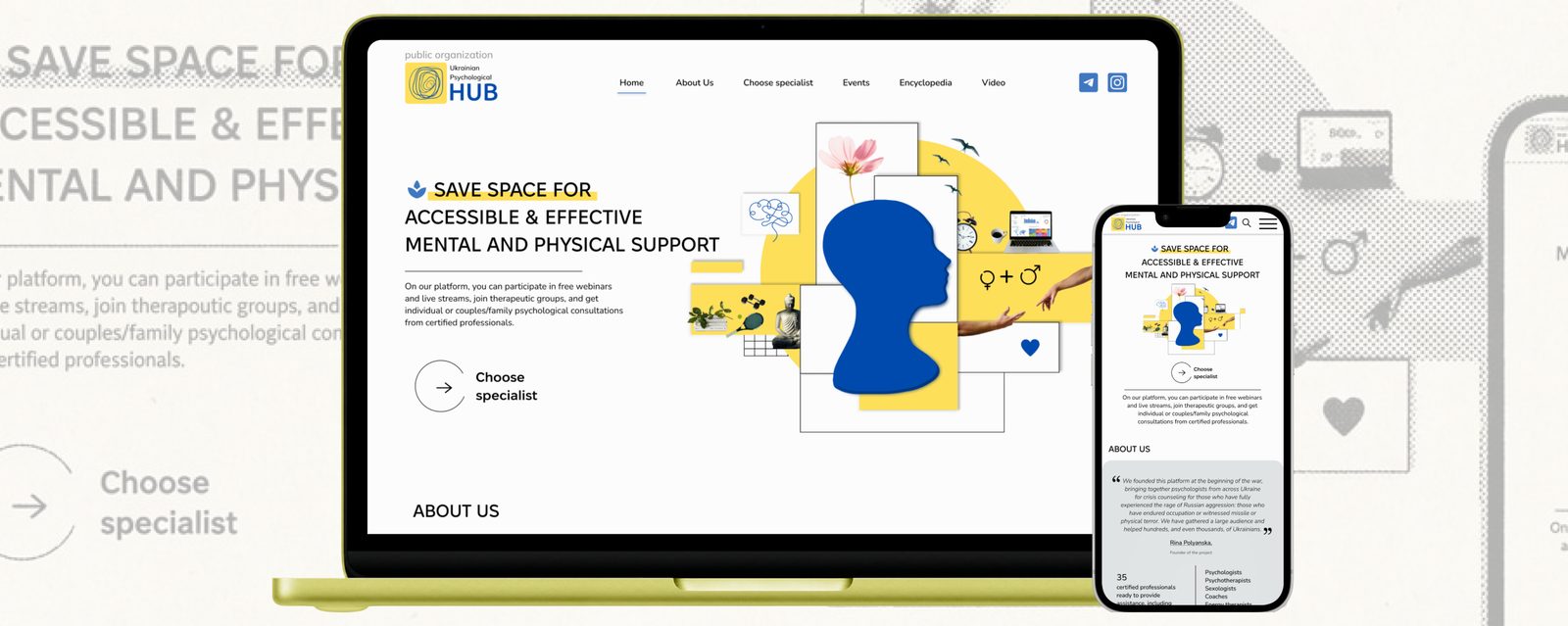
The Ukrainian Psychological Hub launched in 2022 as a volunteer initiative providing mental health support to Ukrainians affected by the full-scale invasion. The original site was built in a hurry, rightly putting speed over experience. As UPH grew toward a sustainable model, the site’s cluttered navigation, dated identity and unscalable structure were holding it back.
Over 16 weeks I redesigned and rebuilt the platform myself: solo, end to end, from research to custom code on Wix.
02Challenge
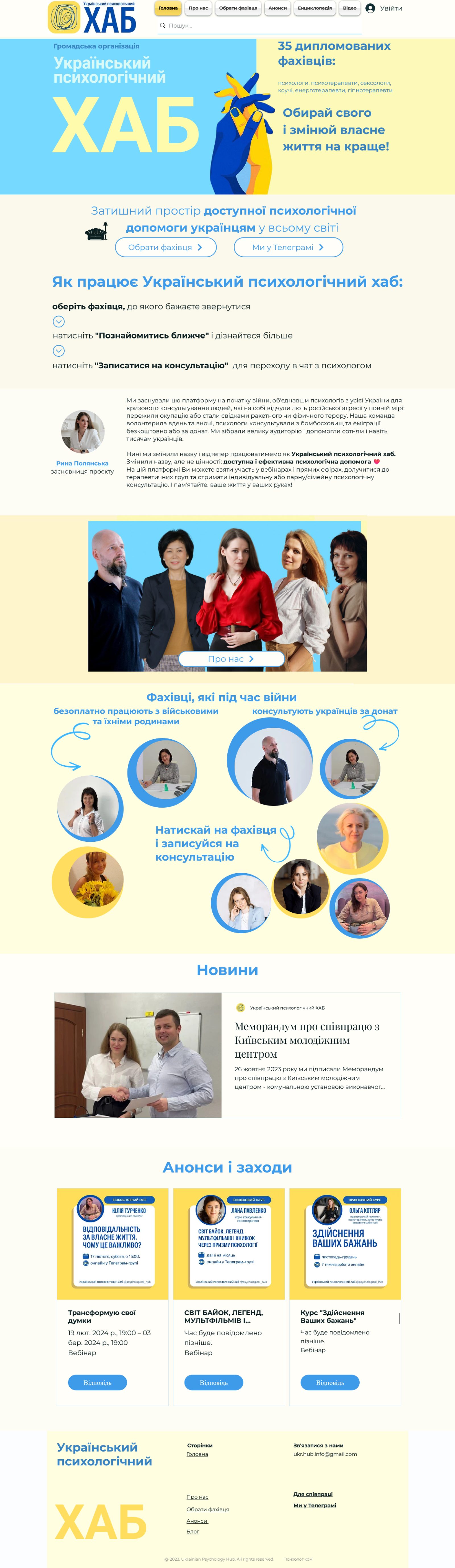
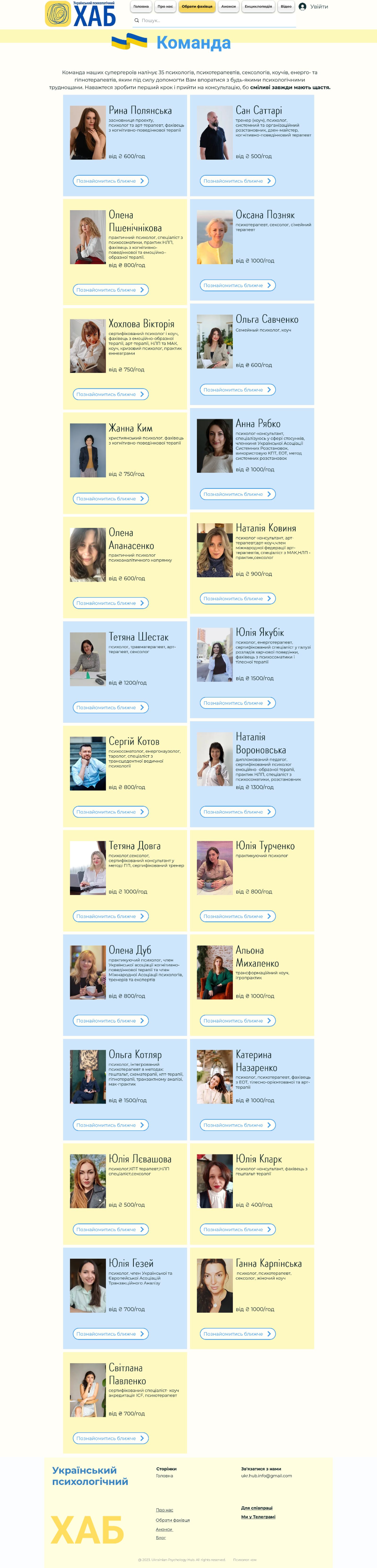
The previous website: scroll to see the full pages.
- Outdated visual design that under-represented the breadth of services
- A cluttered interface driving a high bounce rate
- An inconsistent, uncategorised Specialists page — the core of the service
03Research
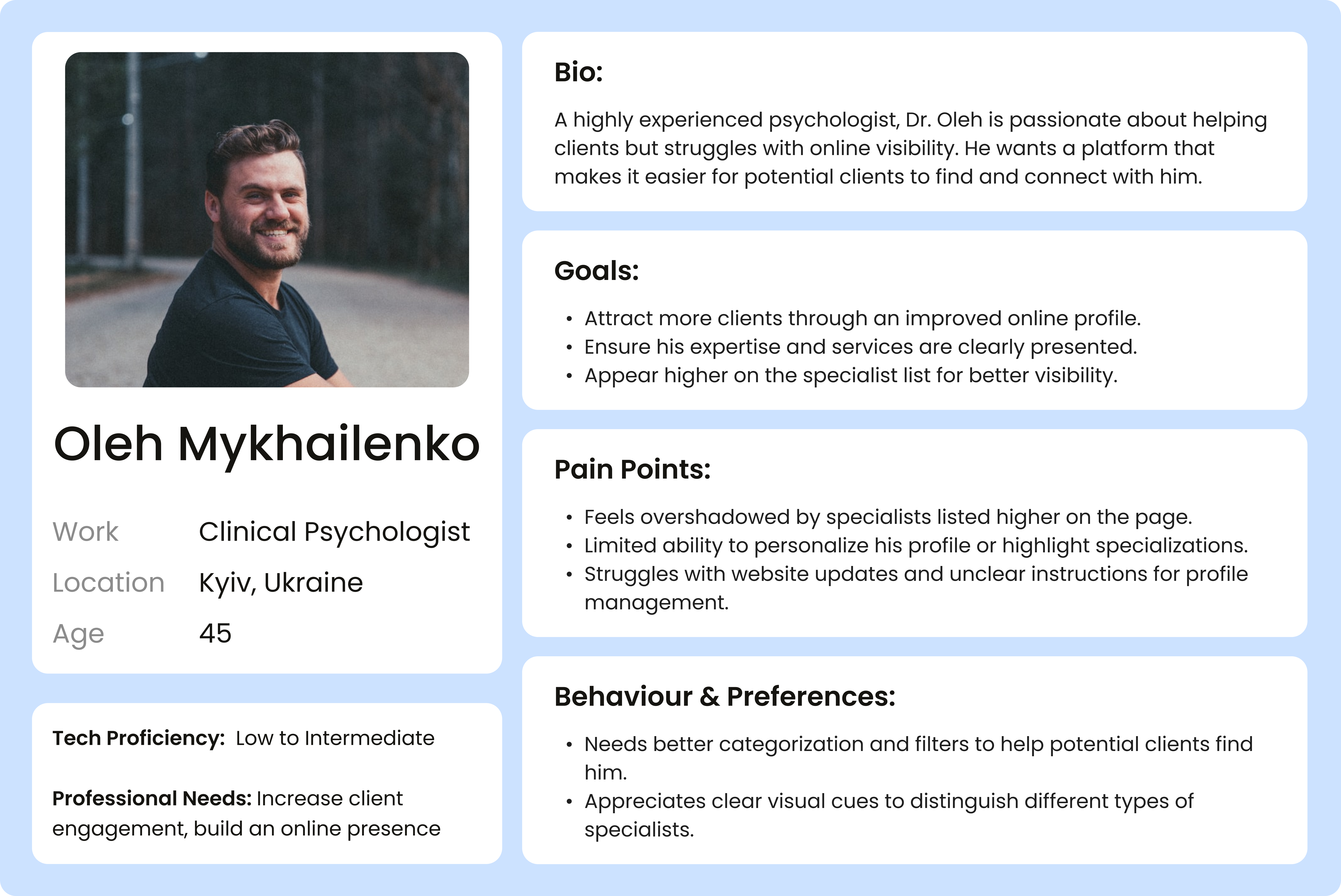
My research looked at both sides of the platform: the people seeking help and the psychologists listed. Three problems stood out: the homepage overwhelmed people seeking help; the specialist list was too long and too thin on detail to compare; and psychologists lower in the list felt invisible.

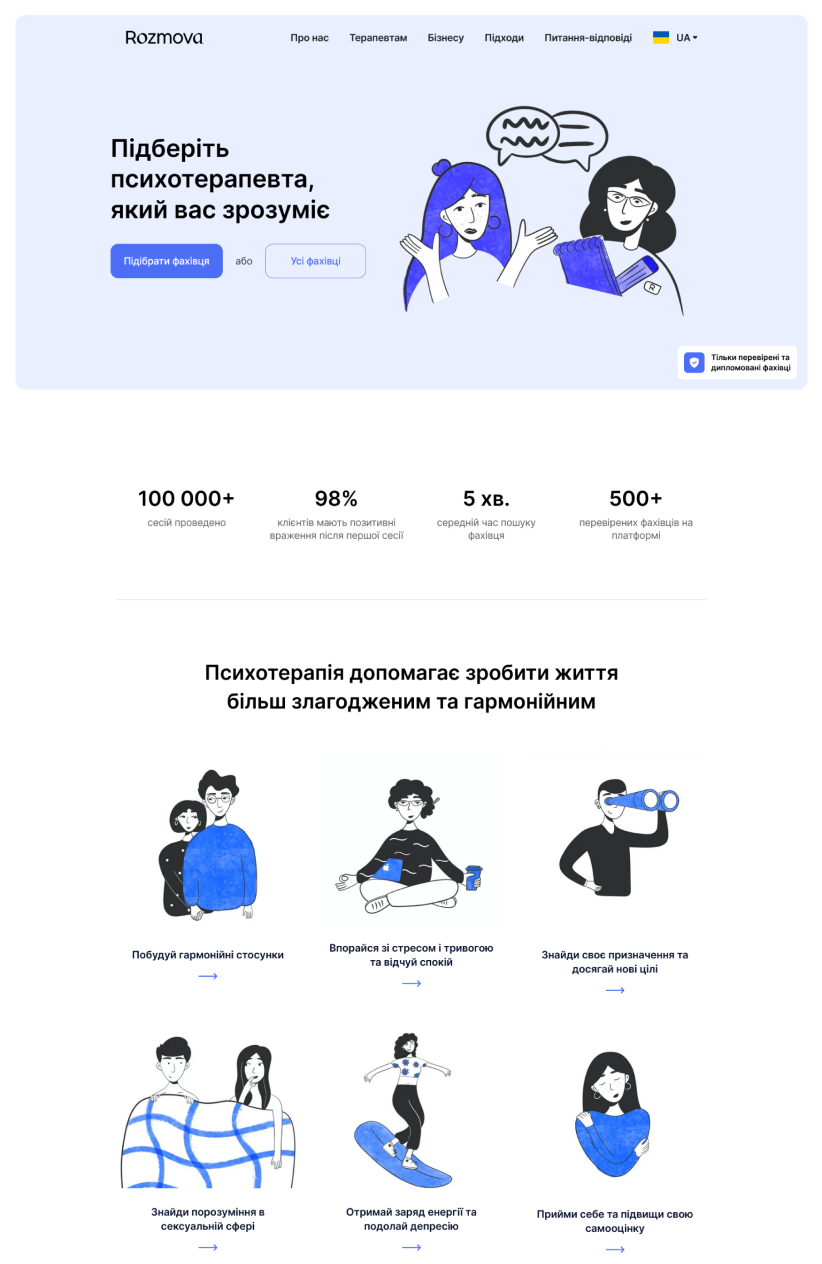
Competitive analysis of Mindly and Rozmova framed the opportunity: Mindly’s full specialist list hides behind a mobile app; Rozmova’s questionnaire narrows choice too aggressively. The best answer sits between them: structured guidance and open browsing.

04Design & build
I kept the logo’s yellow and blue but demoted them to accents, structured the landing page with colour blocking, and designed a hero collage symbolising life’s balance with one prominent CTA.

UPH runs on Wix, so I built most of the site natively in the platform. I only reached for custom code where Wix couldn’t: JavaScript accordion tabs for the new Therapeutic Groups service, and custom-CSS cards for the events and announcements. The rest I set up with Wix’s own tools: the Specialists page reorganised into psychological and physical health with categories and filtering, standardised profile templates, and a cleaner CMS/CRM structure underneath.
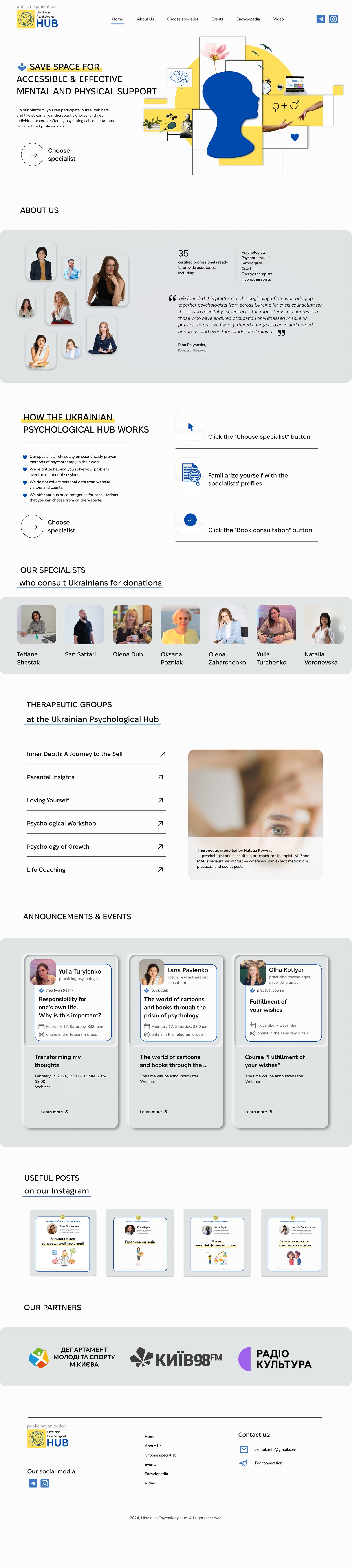
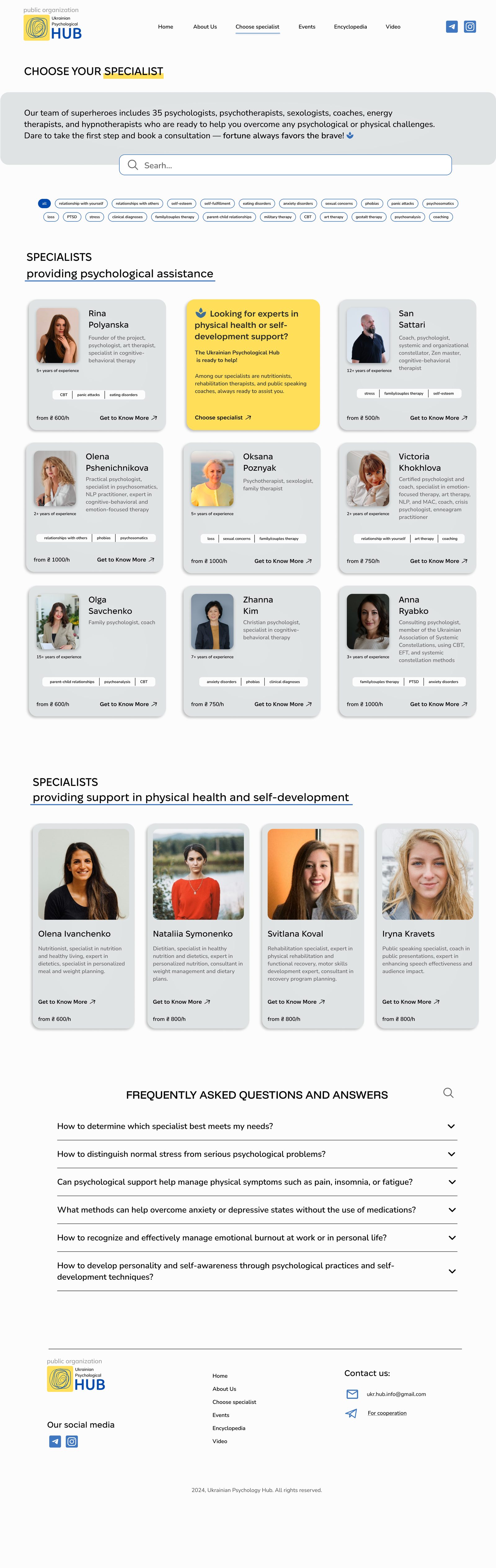
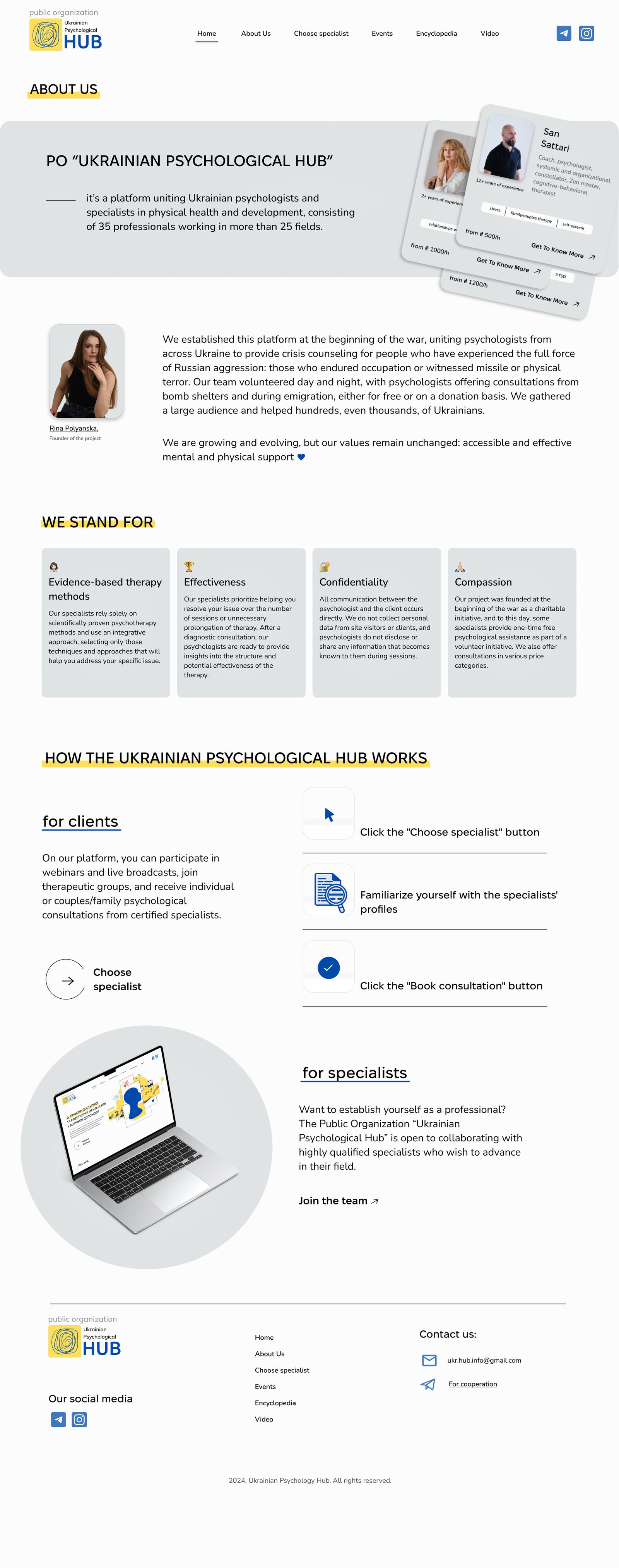
The relaunched site: home, the Specialists directory and the About us page. Scroll each to see the full page.
05Outcome
Engagement measured with Wix’s built-in analytics.
The redesign shipped on the client’s existing platform with no developer handoff. I implemented it myself, including the custom CSS/JS features and the CMS restructure.
06Takeaways
- Start with the hero: when the client and I changed the hero direction, the whole concept had to realign behind it.
- Talk often: regular calls kept scope honest and momentum steady.
- Scope creep is real: visible improvement invites “one more thing,” and a well-defined scope is what ships.