01Overview
Kio’s Wall is an immersive augmented-reality installation at Oakridge Park in Vancouver, part of Canada’s largest redevelopment project. It merges physical design, tactile origami and AR: visitors fold an origami hummingbird, then bring their new avian friend to life through AR on their phones, posing with Kio beneath the installation arch or turning the camera around for a selfie.
I worked with the design team at NGX Interactive on the AR app UI during my practicum, mentored by the project designer.
02The brief
I joined Kio’s Wall partway through. The concept, the user flow and UI screens from earlier client deliverables were already in place. My job was to design the on-screen experience to fit three things: the existing user flow, Oakridge’s brand style guide, and the art direction the team had chosen.
The setting set real constraints. The screens had to hold up under bright ambient light, work for visitors of any age, and guide people who had never used AR, from folding a paper hummingbird to watching it come to life on the camera.
Two screens already existed from earlier client deliverables. I designed six, four of them prioritised for launch.
Adapted from existing designsDesigned from scratch
- 01LandingHold the QR code in frame to trigger the birdPriority
- 02Details overlayEnter a name and email addressPriority
- 03ConfirmedDetails shared successfullyPriority
- 04Decline pathBack to camera, with a prompt to reopen the overlay later
- 05Photo modeOakridge logo and tagline framing the shotPriority
- 06End stateCamera open, thank-you notice in the corner
03My role
Honestly scoped: I was one designer inside the NGX team, designing from an established flow and art direction, mentored by the project designer.
- Designed the AR interface screens, from the existing flow to polished UI
- Explored visual directions and iterated on the one that fit the art direction
- Prepared documentation and assets for development
- Helped with product testing inside the NGX team
04Process
Before designing anything, I studied the user flow and learned Oakridge’s brand style guide. From there I explored several directions, playing with the brand’s shapes, colours and line-work.
We narrowed it to two: a lighter, simpler treatment, and a darker one with bolder shapes. The dark-green direction went forward. Through review the rigid geometry softened into flowing forms, and that shape language carried through every screen.
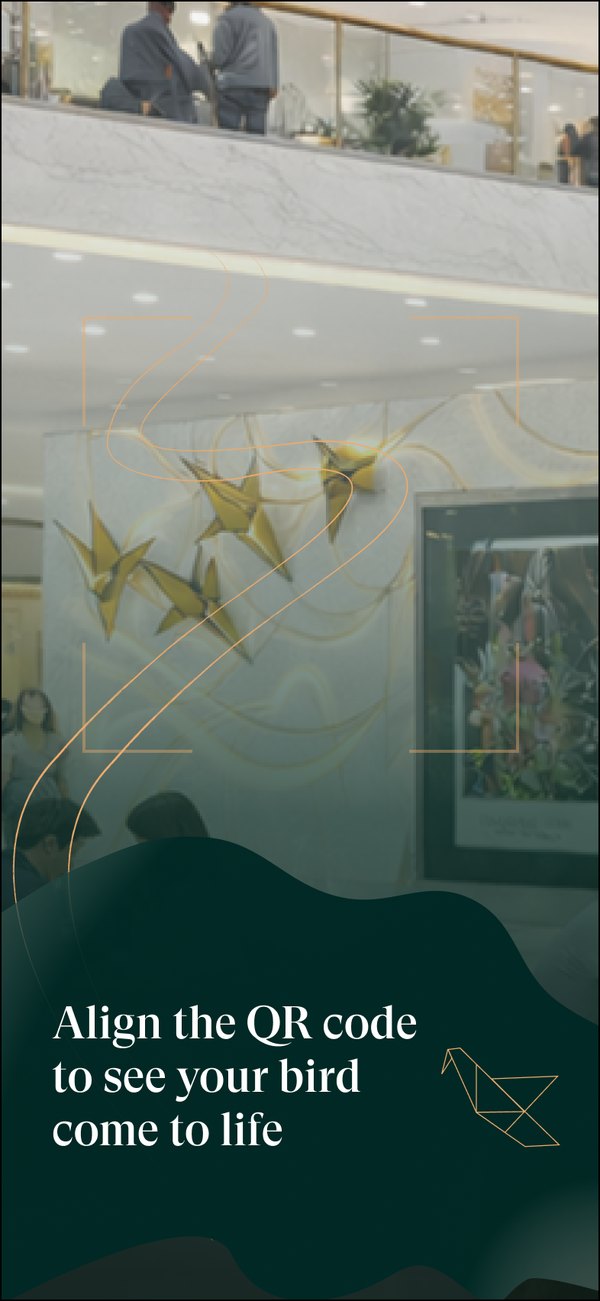
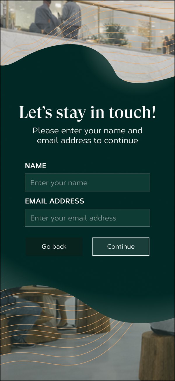
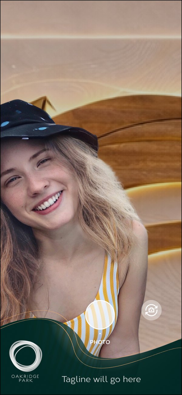
Three of the six screens I delivered: aligning the QR code, entering details, and photo mode.
05Final design
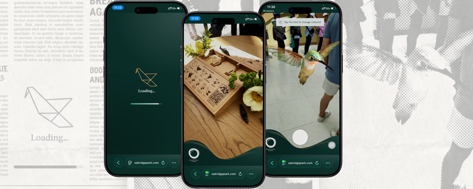
The final screens keep the experience simple and legible in a bright, busy space: align the QR code to summon Kio, add a name and email to continue, then watch the hummingbird come to life over the camera, with photo modes to pose with Kio.
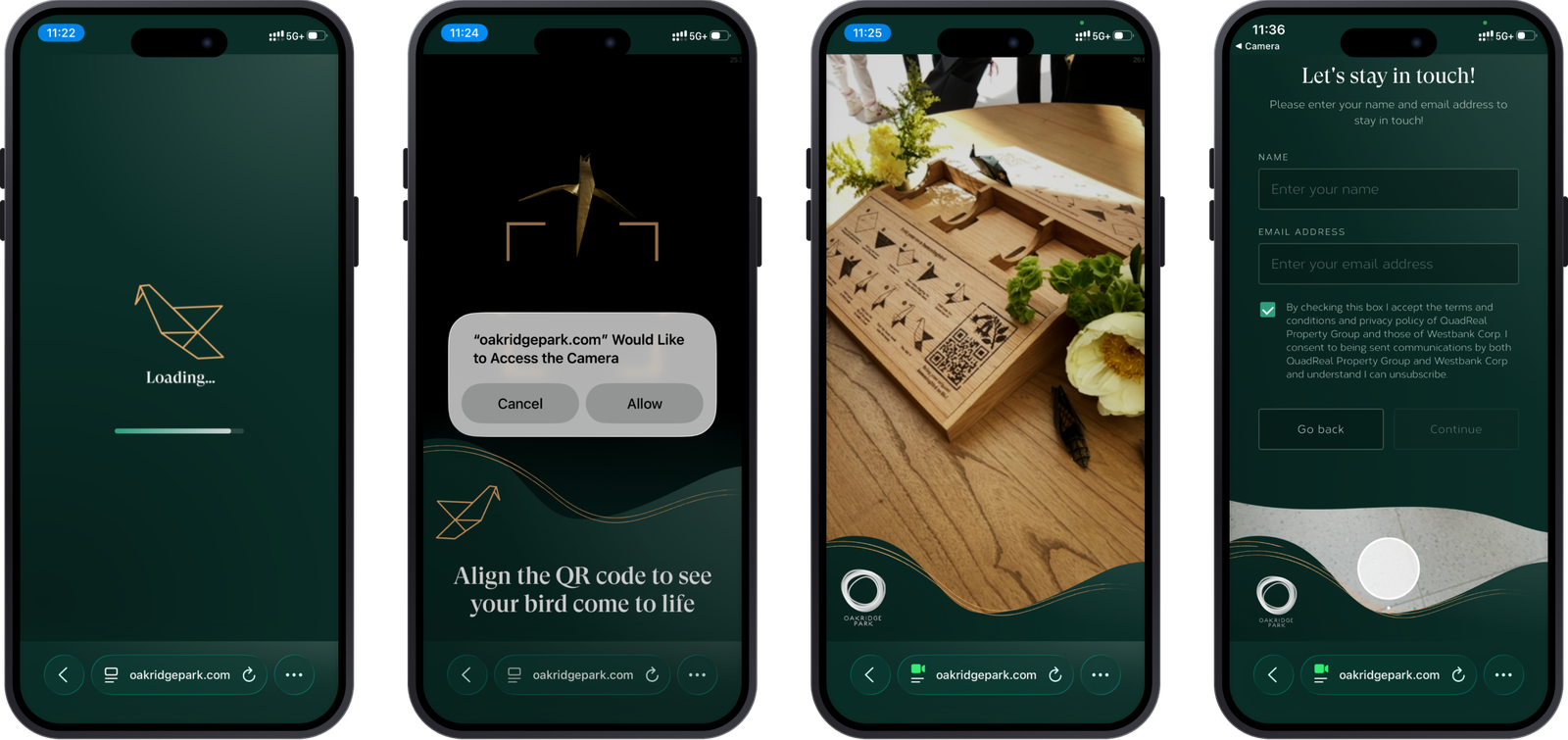
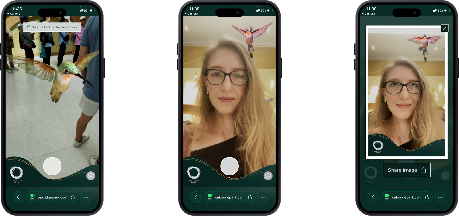
Captured from the live experience at Oakridge Park: align, capture, and Kio brought to life in the camera.
The project designer took the design through its final touches before launch.
06Outcome
Kio’s Wall was my first shipped work in public-space and exhibition design, and the project that confirmed where my two careers meet.
07Reflection
- Trust the flow: when I started designing the surrounding screens, I overthought them. My mentor’s guidance brought me back to the existing user flow as the anchor, and the work fell into place. A good flow is a map; my job was to design within it, not redraw it.
- Ask early: seeking feedback early and iterating on it kept the design aligned with the art direction and moving at practicum pace.
- Where my careers meet: designing a story people walk through, in public space, is the work I want more of.