01Overview
FLUI is Vancouver’s largest student-led design jam, empowering the next generation of UI/UX practitioners through collaboration and professional networking. After participating the previous year, I joined the team as a UI Designer in 2025.
My contributions spanned the rebrand (moodboarding, the colour palette, a custom typeface and visual patterns), as well as the Event page (with a UX partner) and the opening ceremony deck. One deliberate change: the event was renamed from Design Hackathon to Design Jam, dropping the coding connotations to reflect its collaborative, design-first nature.
02The brief
Every year FLUI’s team turns over, so the brand and website are refreshed to match new leadership and an evolving vision. The direction from the internal president was clear: stay close to last year’s identity, but elevate it.
While the UX team ran the website audit and user research, the UI team built the new visual direction: a cohesive set of assets (palette, typography, patterns) for marketing, social and every other brand touchpoint.
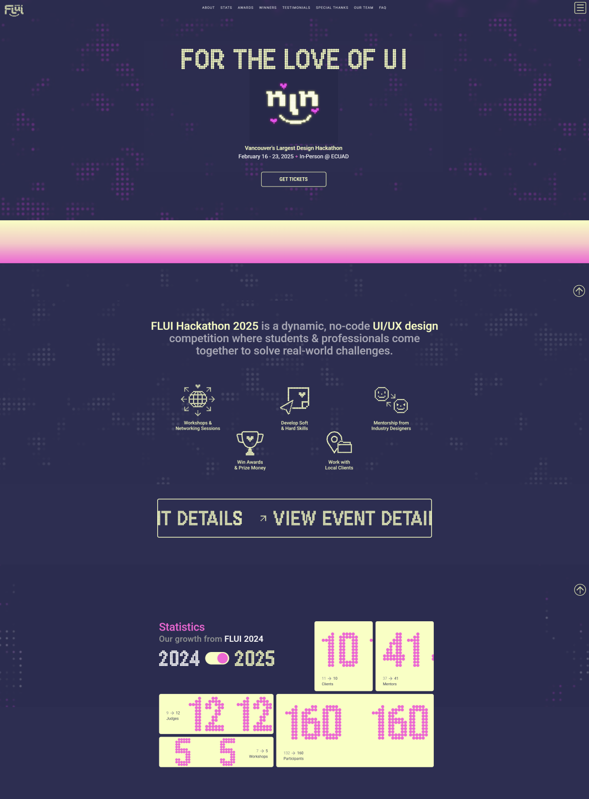
The FLUI website before the redesign.
03New visual identity
Each team member built an individual moodboard; we marked what resonated and synthesised a shared direction: retro-futuristic: pixel typography, neon LED light, fluid gradients, a creative-tech energy that feels nostalgic and forward-looking at once.
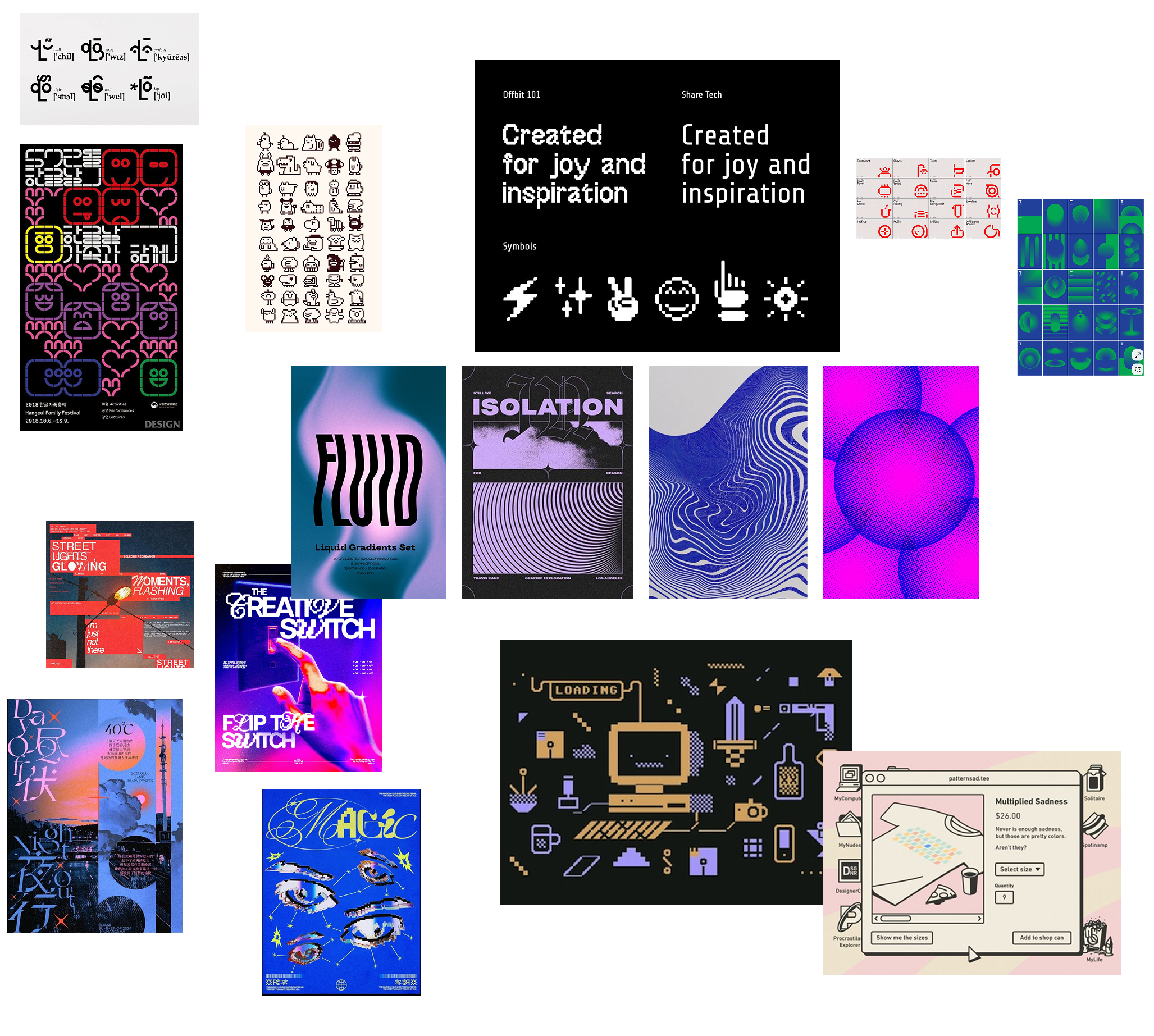
The synthesised team moodboard.
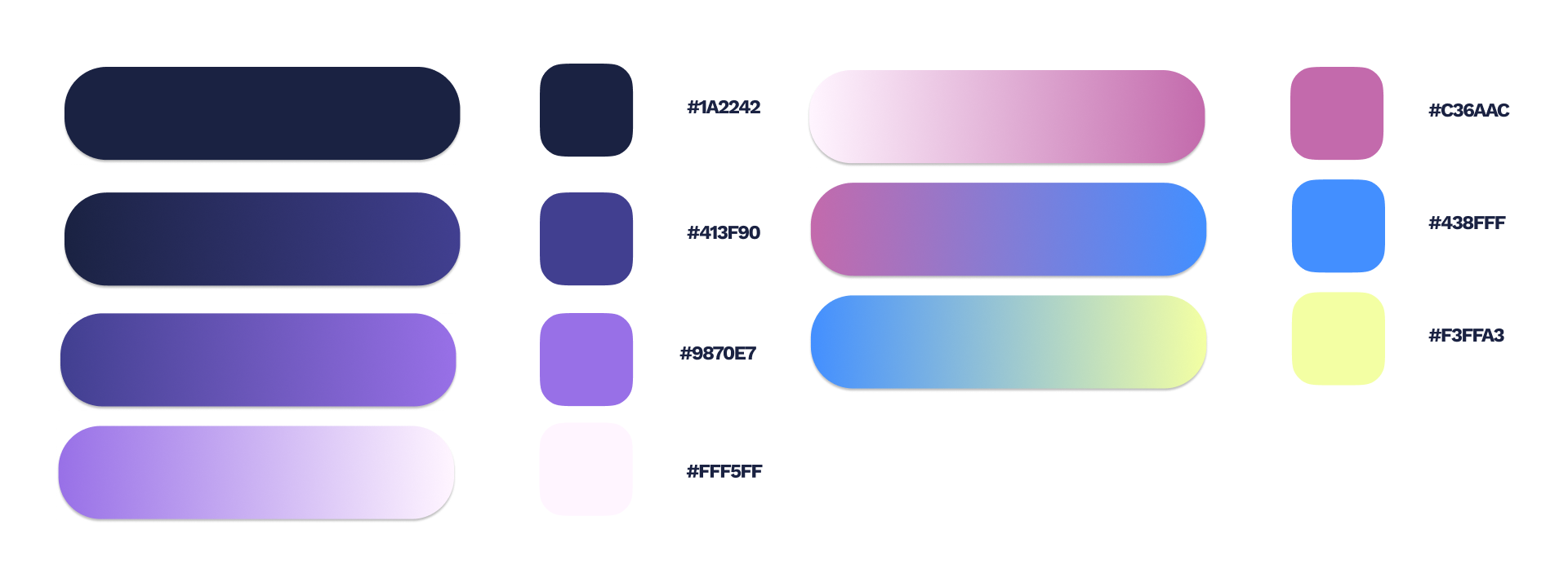
Each designer then proposed a palette, and mine became the foundation: FLUI’s established purple, blue and pink with gradients, elevated with more intention and refined against WCAG contrast requirements.
04The typeface
Flui is a custom typeface created for the Jam, inspired by the previous year’s pixel typography. I led the development of each letter, built from scratch with vector dots, refined into a working font in Calligraphr. It became the typographic foundation of the event’s logo.
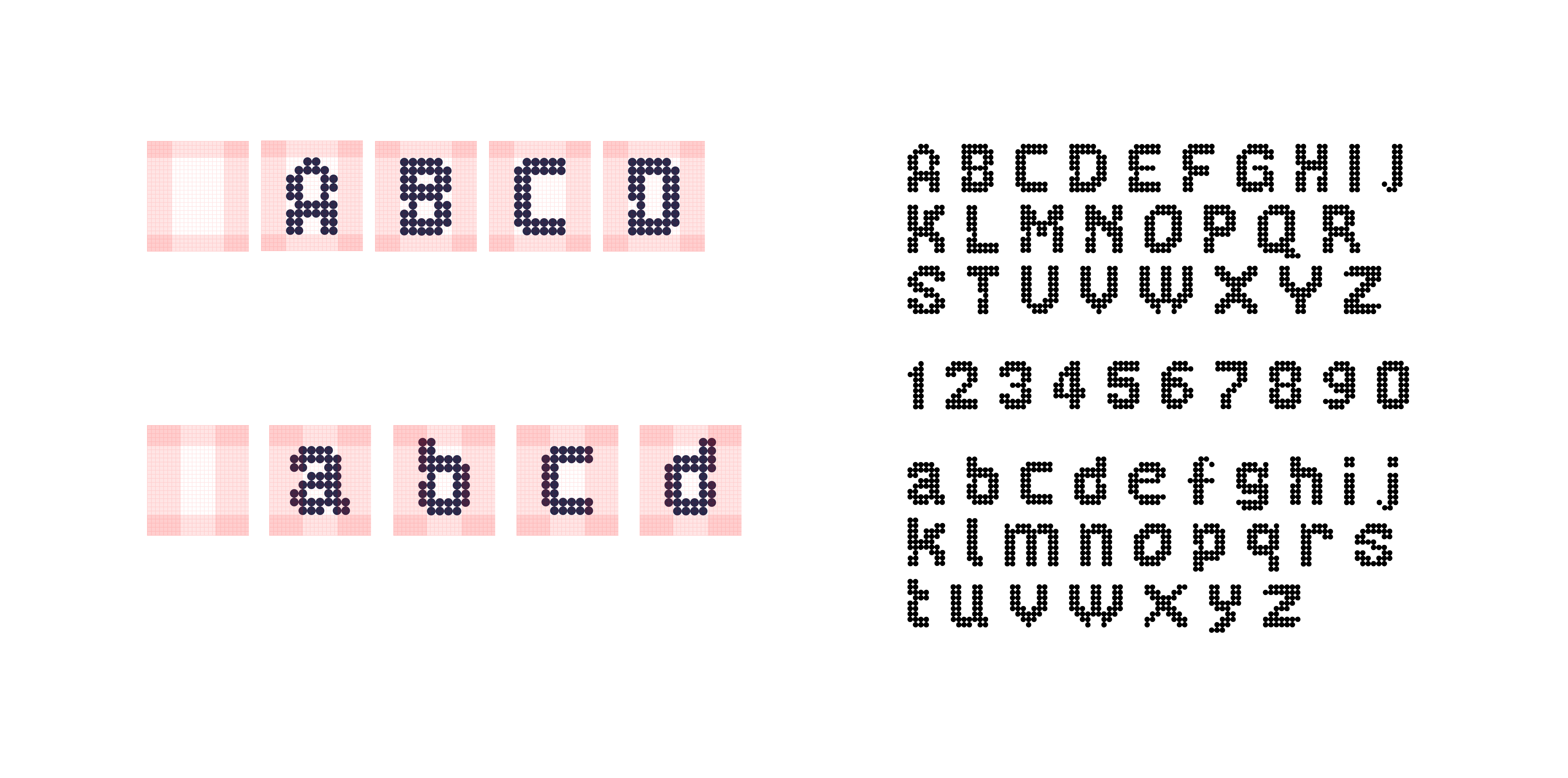
The Flui typeface: every glyph built from vector dots.
To carry the LED aesthetic further, I developed a series of dot-built visual patterns. A dot-grid cloud scene and circular halftone forms became signature elements, applied across the website, decks, social and print.
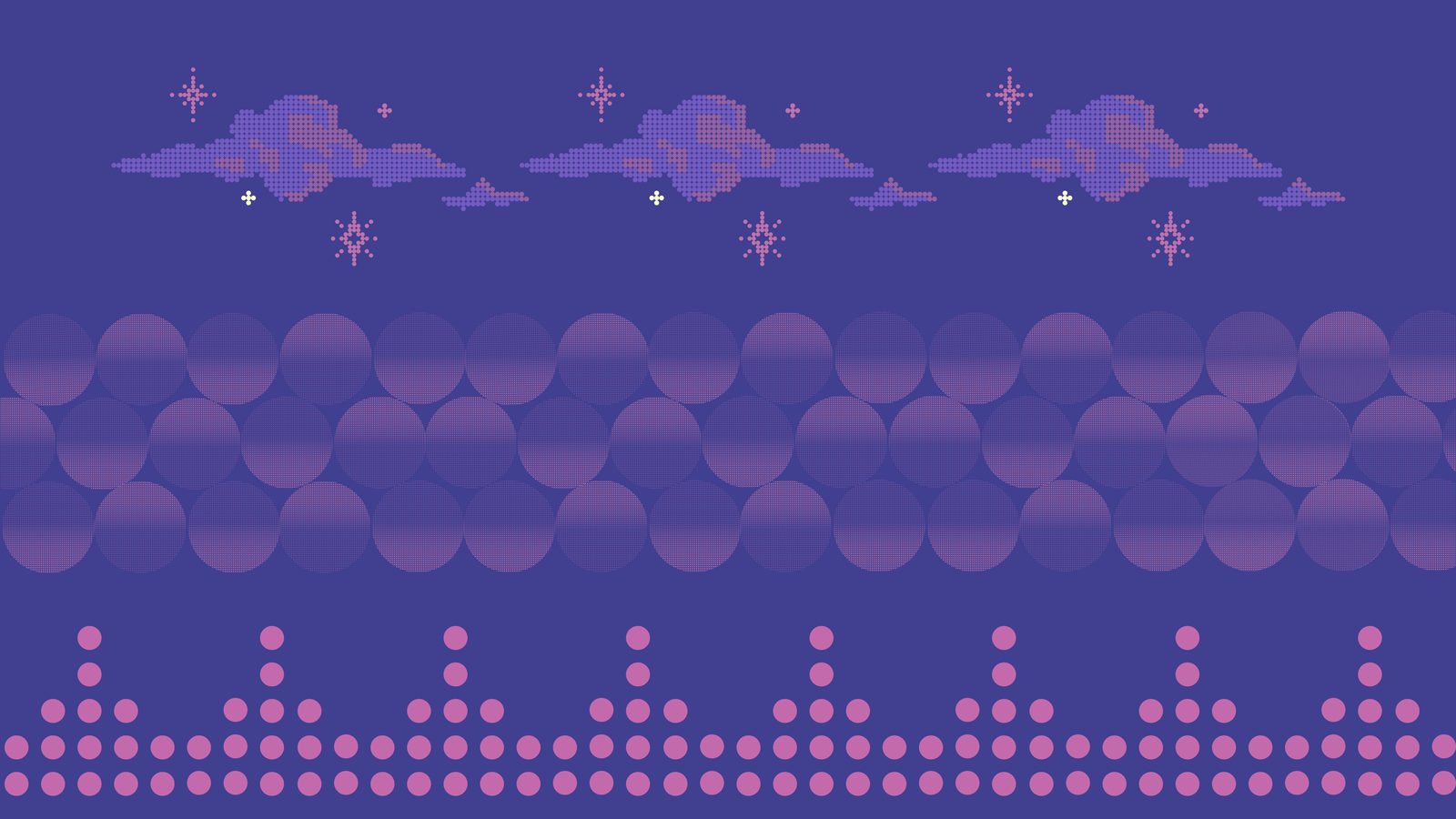
The three source patterns, drawn from the LED dot grid.
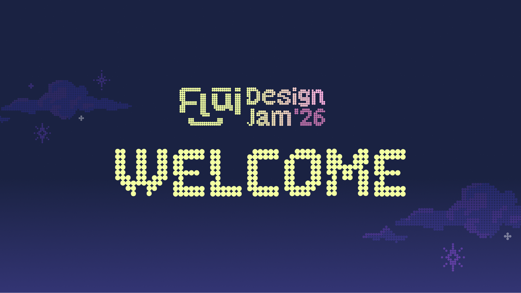
Opening ceremony deck: typeface and cloud pattern carrying a full-bleed slide.
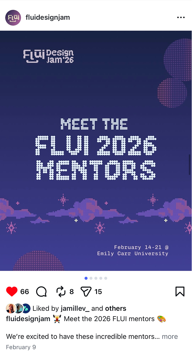
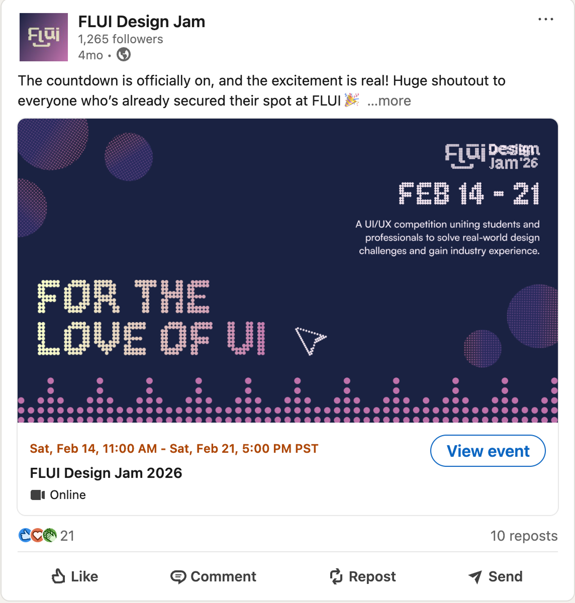
The system on social: portrait and landscape, same vocabulary.
05Event page
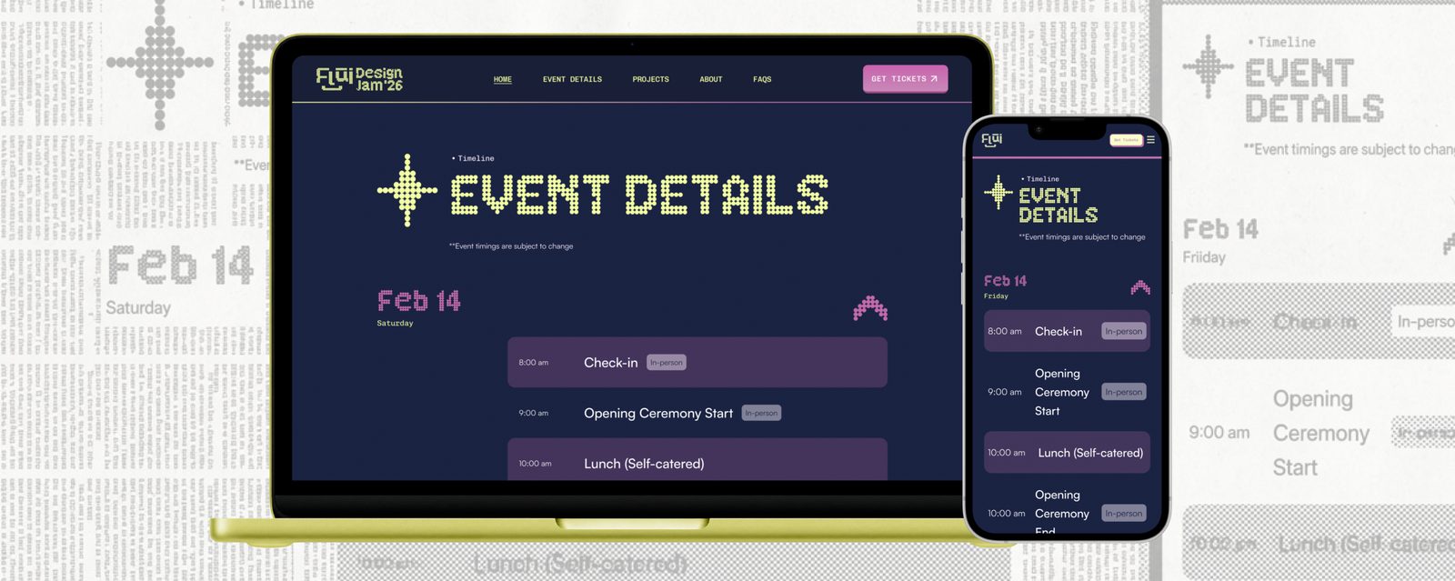
The Event page was designed in close collaboration with UX designer Plinio Pedra, working from his lo-fi wireframe: a three-day schedule accordion, Workshops & Speakers, a Project Client slider, and a Location section with a custom dot-grid world map.
The hardest problem: sponsor logos vary widely in colour and format on a dark background. My answer was a folder-style card component with a consistent pink backing, readable regardless of the logo. Fully designed and prototyped; cut from the final build only by timeline and late client additions.
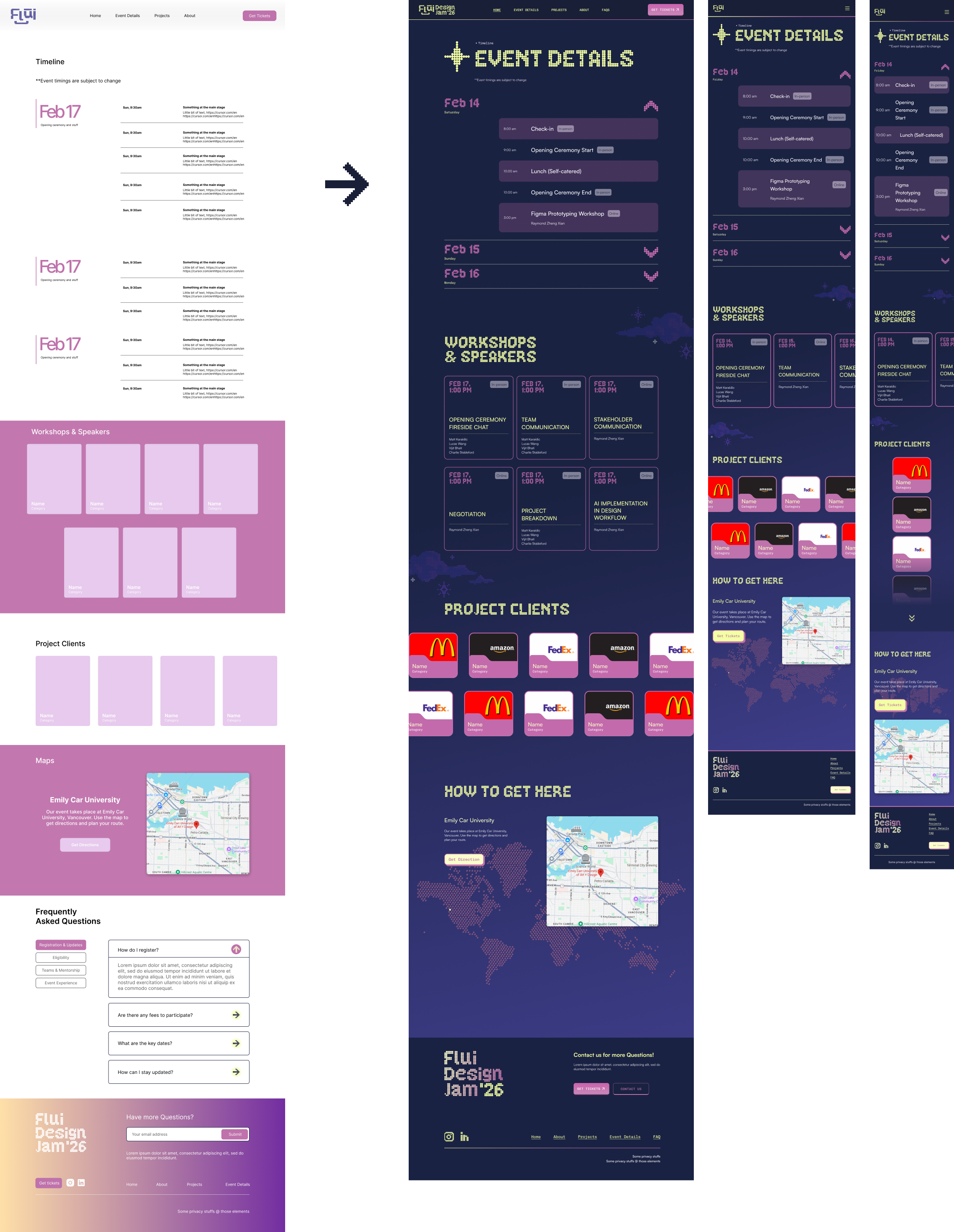
The Event page: fully prototyped in Figma, handed off ready for development.
06Outcome & takeaways
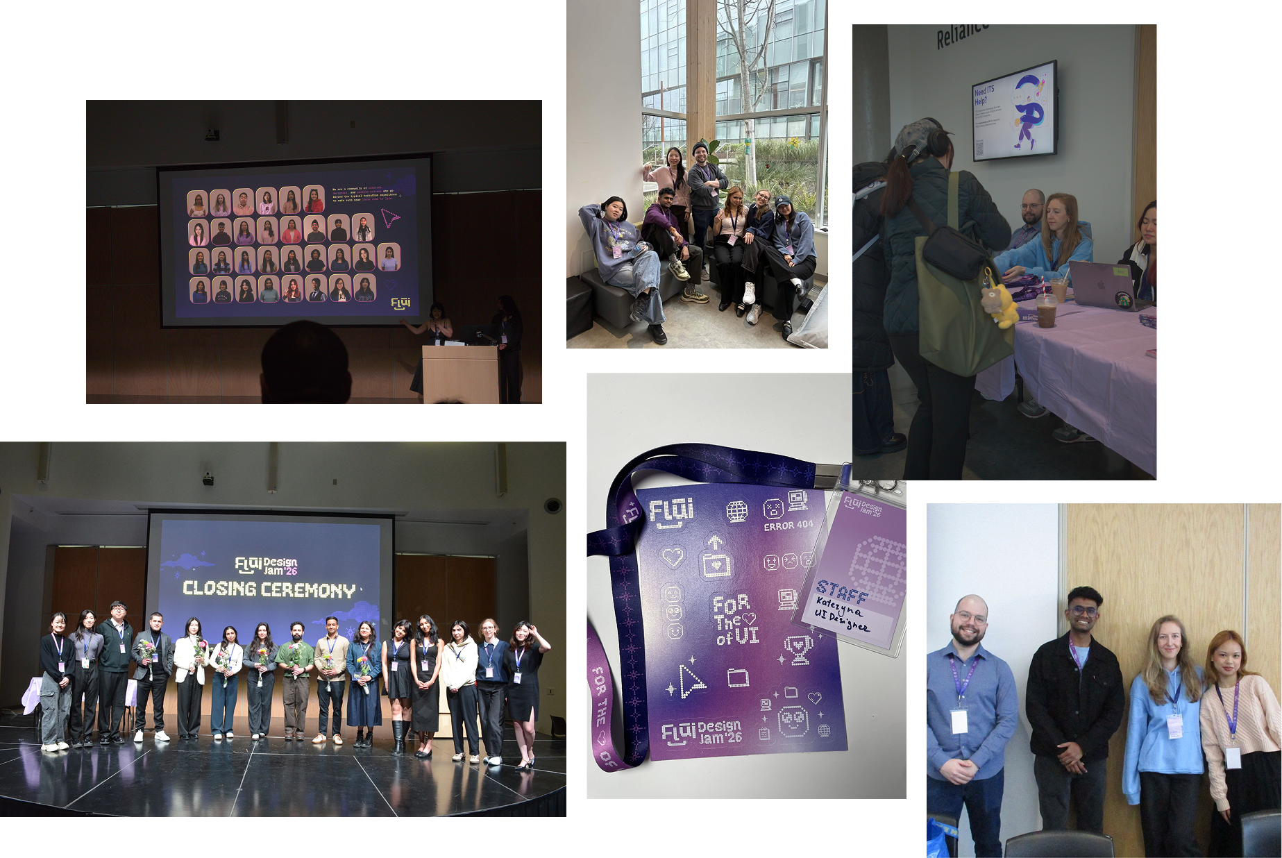
The Jam, wearing its new identity.
- Structure enables creativity: well-defined roles made decisions faster and the work better.
- Real-world teams aren’t academic teams: hierarchy gives you momentum instead of holding you back.
- Take the task you’re least ready for: the typeface became the work I’m proudest of, and it started as the one I was least qualified for.