01Overview
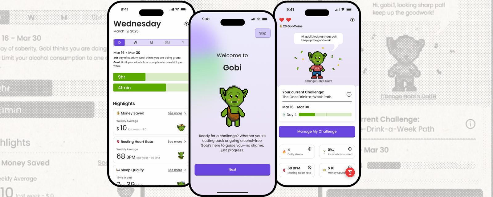
Gobi is a gamified sobriety app for the sober-curious, a self-initiated concept exploring how design can support behaviour change and make cutting back feel engaging and human rather than clinical. Team of four; I owned UX/UI across research, flows and final UI.
02Research & the pivot
We started with a hypothesis: young adults (19–29) struggle to find alcohol-free social spaces. To test it, we began with in-context observations across four venues: a mocktail eatery, a non-alcoholic retail space, a traditional bar and a games venue.
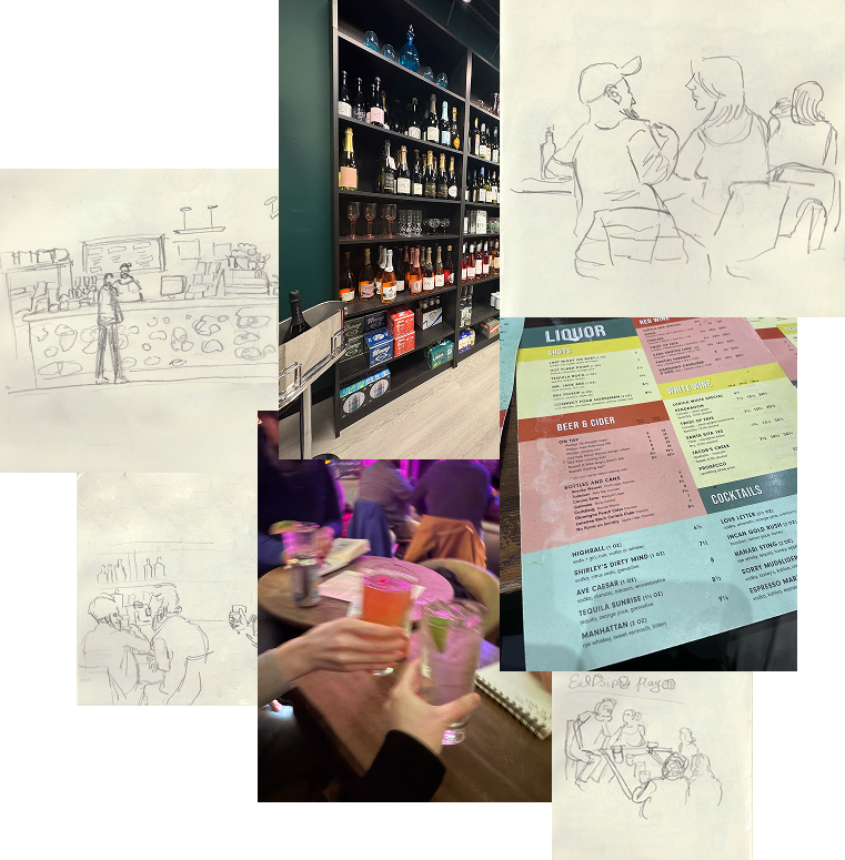
In-context observations across four venue types.
Next, we ran a survey to size up the behaviours we’d seen in person:
Finally, we interviewed people who had taken the survey, digging into the needs and behaviour patterns behind their answers. Across all three methods, one insight held: awareness of spaces wasn’t the barrier. Staying motivated after the decision was. Many people weren’t quitting; they were cutting back and losing consistency. That is what led us to pivot.
03Meet Gobi
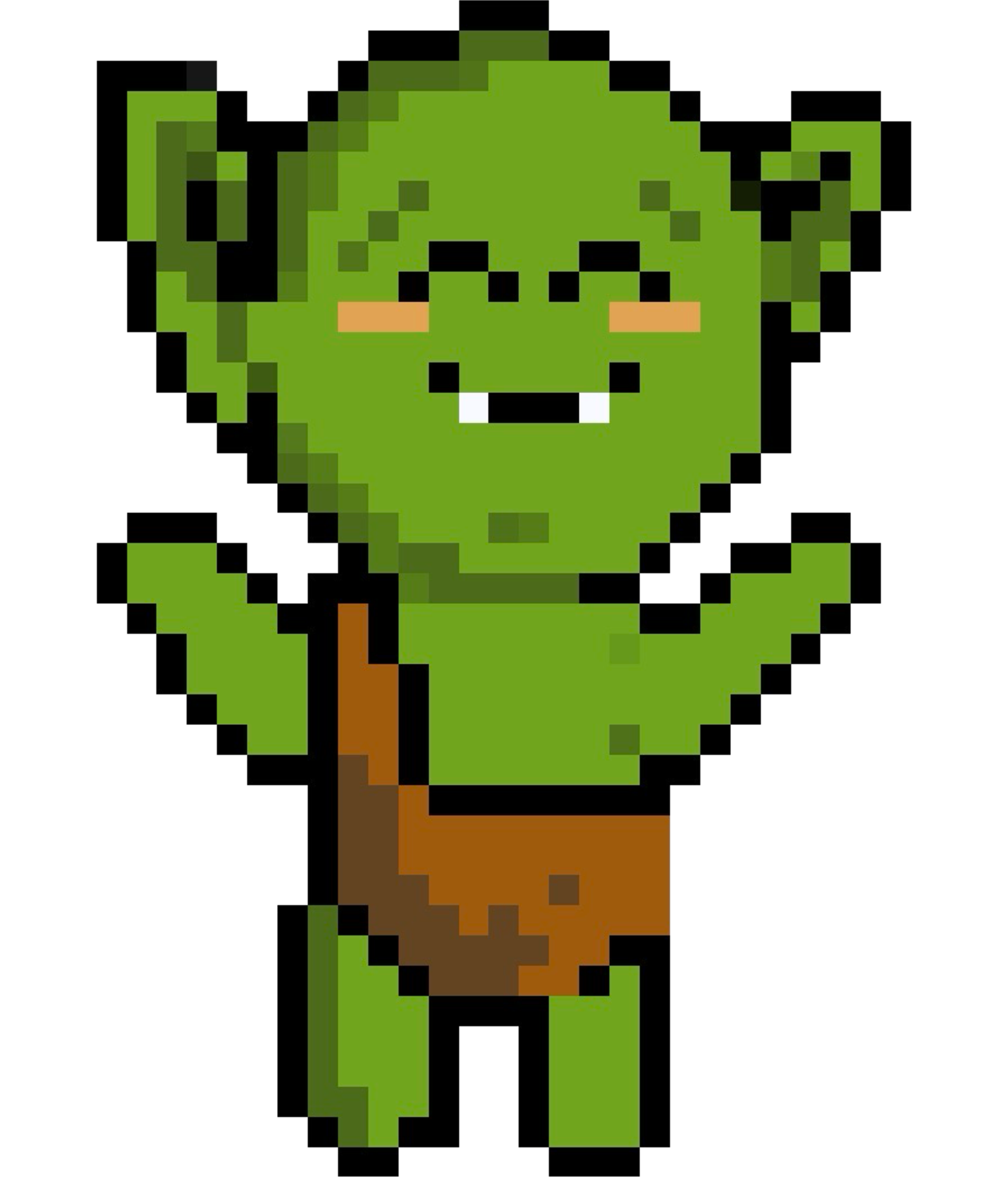
Gobi is a goblin: stubborn, chaotic, not known for personal growth. That’s why it works. It flips the script: Gobi starts “primitive” and evolves as the user takes on challenges, unlocking looks and milestones that celebrate progress.
- Progress over perfection — no shame, just steps forward
- Gamified feedback loops that reward, not lecture
- GobCoins for engagement and reflection; an avatar that grows with you
- Measurable wellness metrics: sleep, heart rate, money saved
04Wireframes & testing
The wireframe plan centred on motivational tracking: personalised challenge paths (like “one drink per week”), coaching styles, health metrics and rewards.

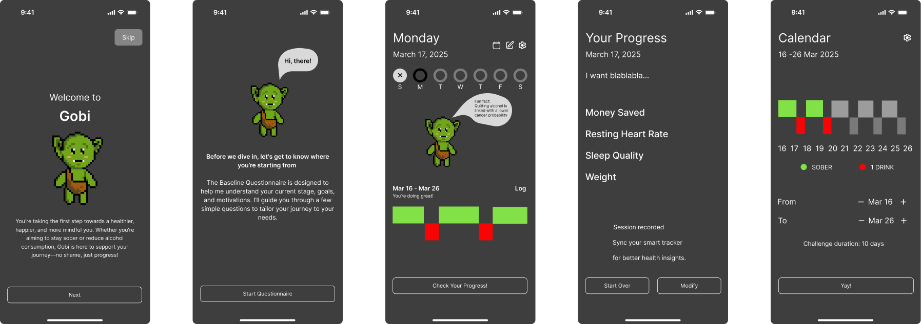
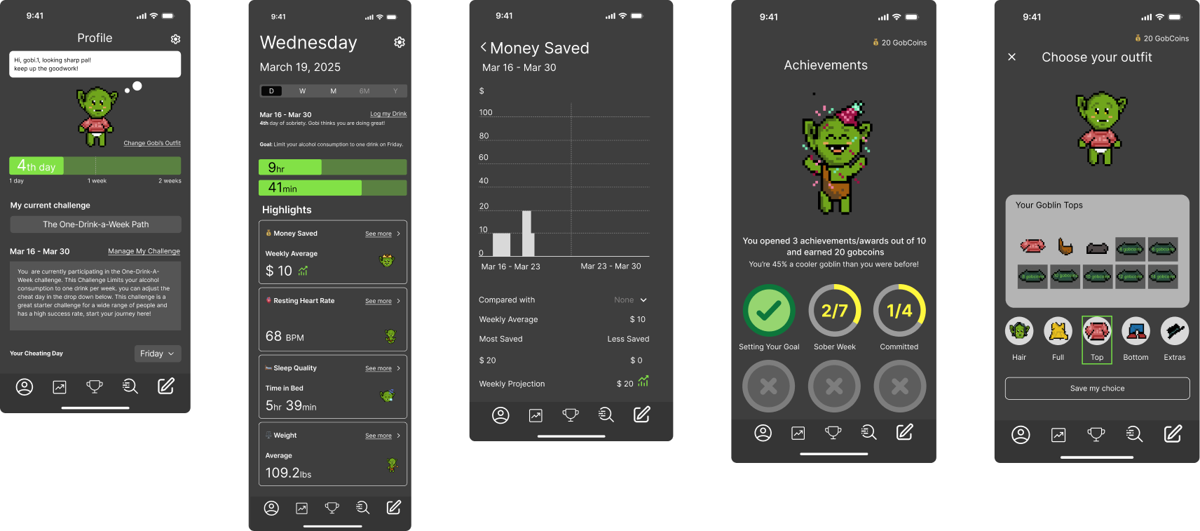
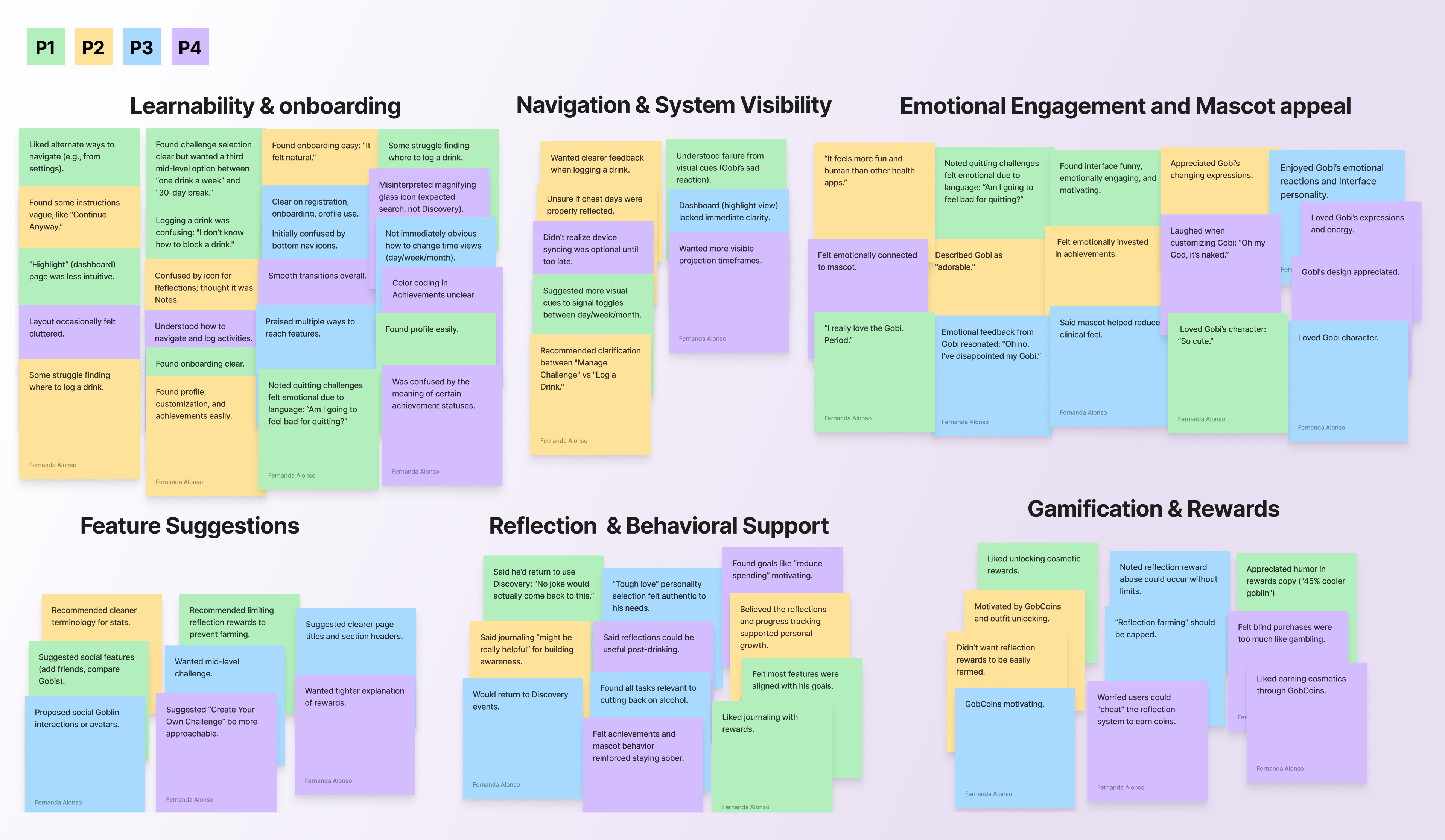
Usability tests over Zoom surfaced three findings: users formed a real emotional bond with the mascot (“I feel like I’ve disappointed my Gobi”); journaling built awareness when tied to emotional triggers; and “reflection farming” (short low-quality entries for rewards) was a real exploit we designed against.
05Final UI
With Gobi as the emotional focal point, the interface stays clean and minimal. I explored two profile-page directions; the team chose the compact layout with a visible challenge timeline for at-a-glance progress.
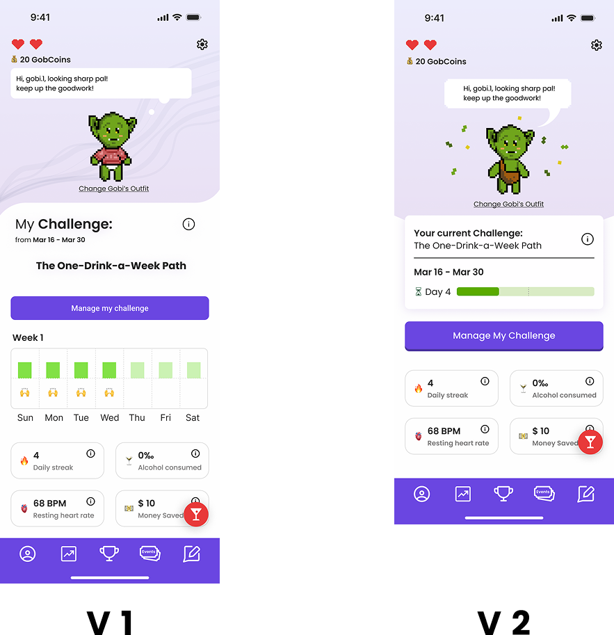
Two directions; the compact timeline won.
The system balances playfulness and structure: pixel-art energy in a legible UI, Poppins for warmth, a purple-forward palette anchored in wellness.
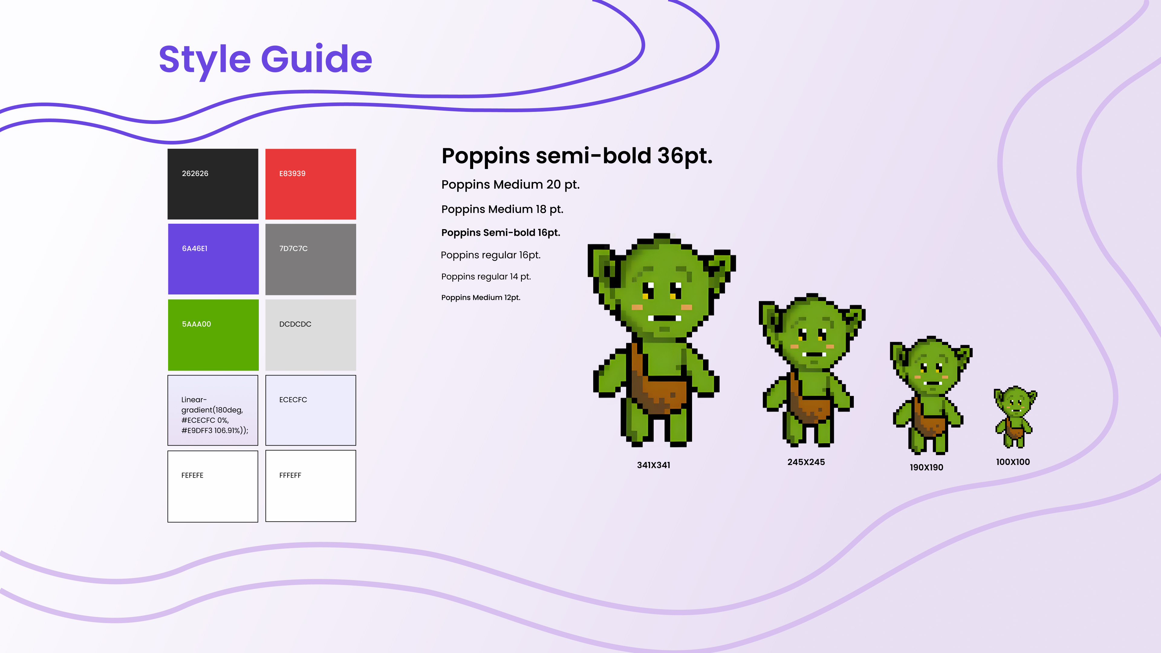
The Gobi style guide: type, colour, components.
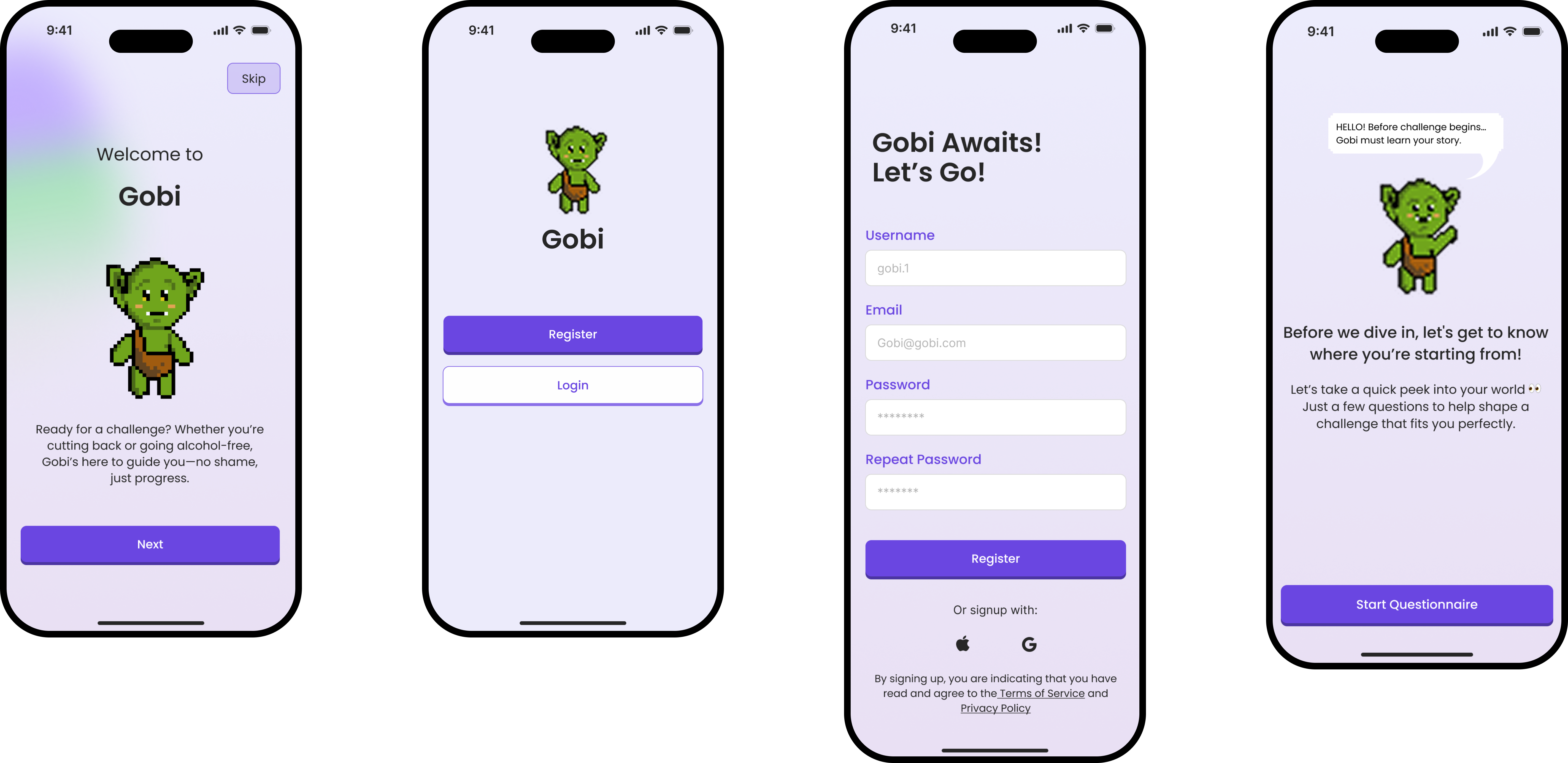
Onboarding & registration.

Questionnaire.
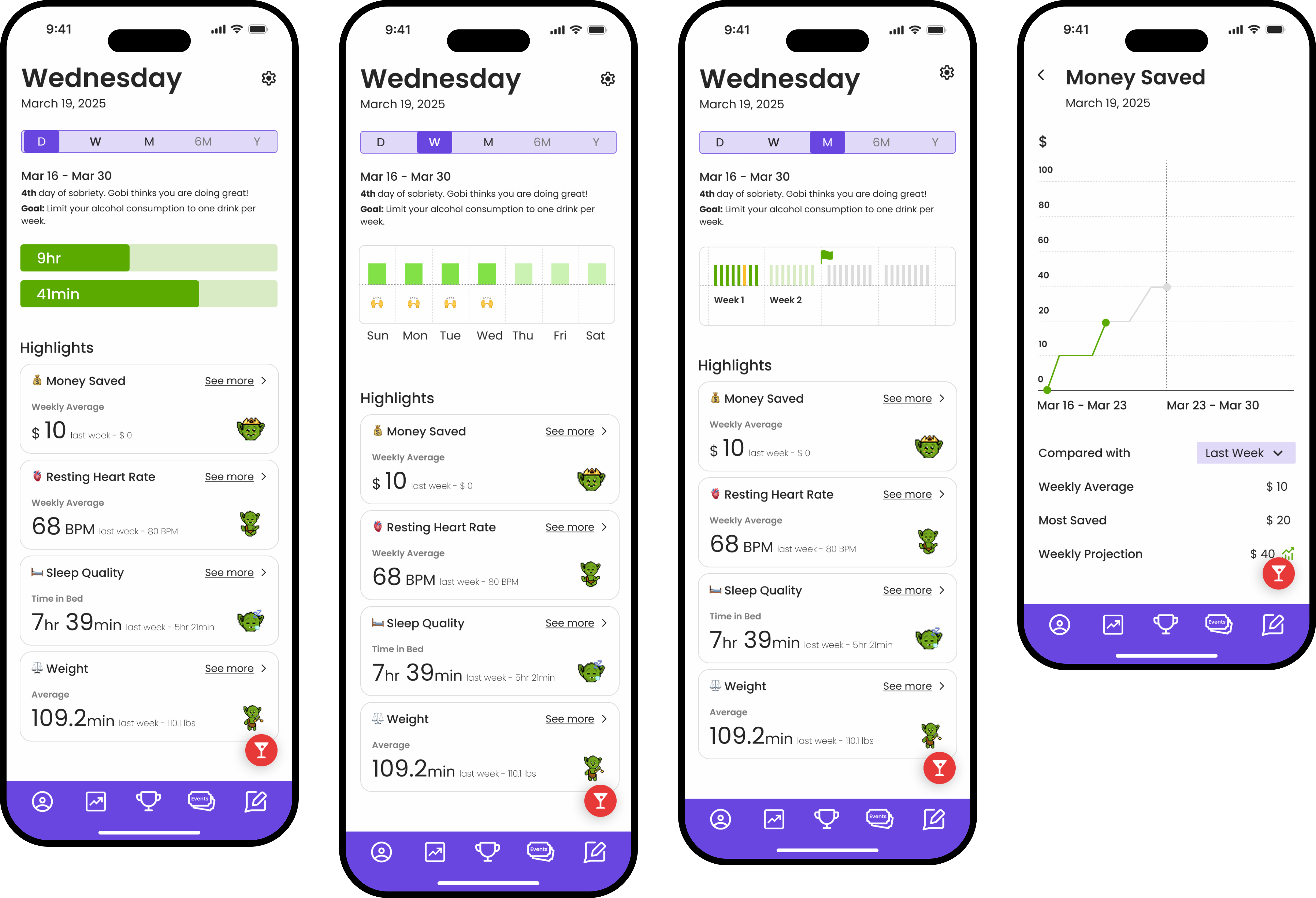
Tracking progress.
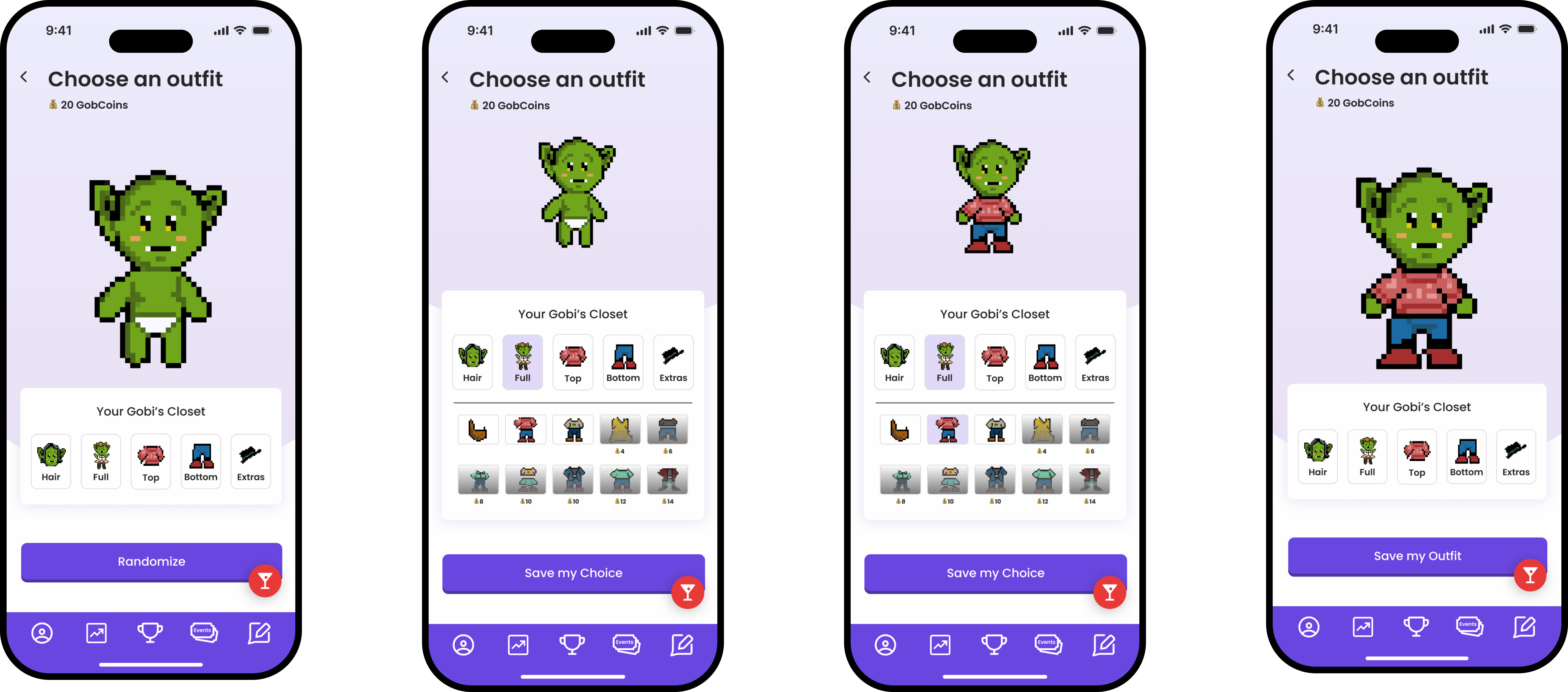
Changing outfit.
06Takeaways
- Pivot early: letting go of the original direction saved us weeks of building the wrong thing.
- Let the character lead: the mascot gave every decision a test: would this feel right for Gobi?
- Gamification needs restraint: every mechanic has to answer “what behaviour does this reward?”