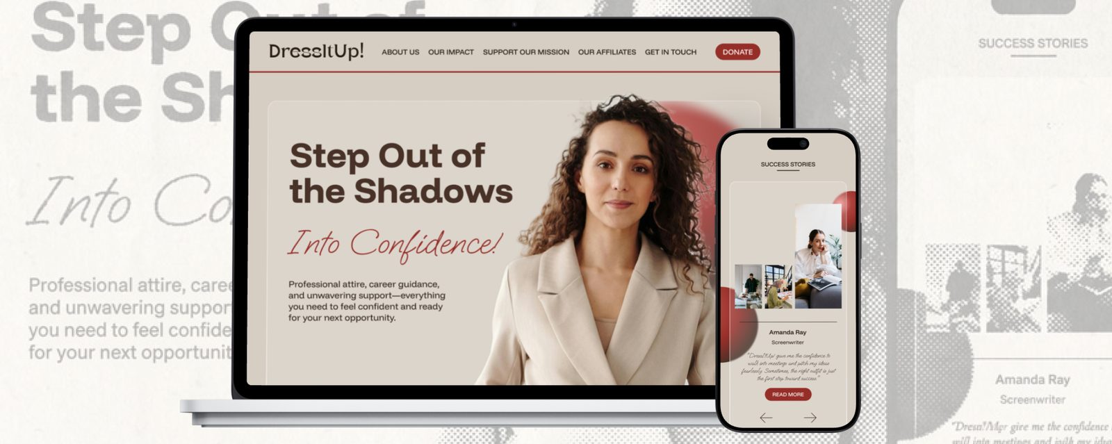
01Overview
Dress for Success Canada Foundation is a registered charity supporting women and non-binary people toward economic independence, working with 13 affiliates across Canada on pre-employment programs, professional attire and community. A 12-week solo concept project: rebrand and full site redesign.
02Audit
The existing site communicated dignity and hope in its logo, but the red-heavy palette read corporate, the layout felt dated and inconsistent, and the services themselves were hard to find. The stories, the most powerful asset a nonprofit has, weren’t being told.

The existing identity and site.
A competitor review of YWCA Canada and the Canadian Women’s Foundation showed what works: bold, empowering imagery, storytelling, impact statistics, and clean navigation (with gaps on mobile that I could avoid).


03New identity
The vision: a digital space that feels modern, inclusive and inspiring, with real women’s stories and accessible services at the forefront. The moodboard centred on women in real work environments, glassmorphism, grid layouts, and a mix of circular and rectangular shapes: structure softened with personality.

Typography and colour balance strength with warmth. I tested every colour against WCAG before it touched the interface.

04Wireframes
Multiple layout sketches explored how to weigh mission, services and success stories, balancing emotional resonance against functional clarity, on a grid that flexes across screen sizes, with calls to action guiding users toward support, donation or participation.

05Solution
The final site communicates the mission clearly and gives users an intuitive path to services, stories and engagement. It’s built from flexible, reusable modules (hero, story cards, service highlights, CTA blocks), each designed accessibility-first and responsive by default.


The module guide documents every reusable block, so the system can scale to new pages without rework.


06Takeaways
- Accessibility is the mission: for a nonprofit, WCAG-compliant colour, type and focus states mean the people who most need support can use the site and feel respected by it.
- Early systems save rework: tokens and patterns defined up front let pages adapt without redoing them.
- Modular blocks move fast: reusable components keep the site cohesive and easy to grow.